Color Vision Deficiency Simulation, Non-Chromatic Cues, and Semantic Color Systems Beyond Basic WCAG Ratios
Moving past contrast alone to create interfaces that remain functional and meaningful for the hundreds of millions of people with color vision deficiencies.
Color is a powerful but unreliable carrier of meaning in digital interfaces. For the approximately 300 million people worldwide with color vision deficiency (CVD), or color blindness, reliance on hue alone can render information invisible or misleading. While WCAG guidelines require a minimum contrast ratio and prohibit using color as the sole means of conveying information, these rules represent a floor, not a ceiling. Many interfaces that pass automated contrast checks and basic “use of color” audits still fail users with CVD in real-world scenarios.
True accessibility requires going beyond ratios and basic prohibitions. It demands simulation testing, deliberate use of non-chromatic cues, and the adoption of semantic color systems that prioritize meaning over appearance. This article examines why simulation and redundancy matter, explores proven techniques, and outlines how modern design systems can build color practices that work for everyone.
Understanding Color Vision Deficiency in Interface Design
Color vision deficiency affects the ability to distinguish certain hues, most commonly red and green (protanopia/protanomaly and deuteranopia/deuteranomaly), with rarer blue-yellow deficiencies (tritanopia) and complete monochromacy. Prevalence is significantly higher in men (roughly 8%) than in women (0.5%), though exact figures vary by population and definition.
The implications for UI design are profound. A red error state next to a green success state may appear identical. Charts relying on color to differentiate series become unreadable. Buttons or links distinguished only by hue lose their affordances. These failures are not merely aesthetic; they can prevent task completion, create confusion, or exclude users entirely.
Importantly, CVD is not the same as low vision or low contrast. A palette can achieve excellent contrast ratios yet remain inaccessible if meaning is encoded solely in hue. This distinction is explicitly recognized in accessibility literature: contrast solves one problem; discriminability solves another.
The Limitations of Contrast-Only Approaches and the Role of Simulation
WCAG Success Criterion 1.4.1 (Use of Color) states that color must not be used as the only visual means of conveying information. Success Criterion 1.4.3 addresses contrast. Together they form the regulatory baseline.
However, contrast calculations assume standard trichromatic vision. They do not account for how colors appear when one or more cone types are missing or anomalous. A design can pass every contrast checker and still present indistinguishable states to a deuteranopic user.
This is where simulation becomes essential. Tools such as Color Oracle, Coblis, Sim Daltonism, and built-in browser or design-tool simulators (Firefox Accessibility panel, Figma plugins, Stark) approximate the experience of different CVD types. They apply matrix transformations to reveal collisions that contrast metrics miss.
Research published in 2025 in the Journal of Imaging demonstrated that users with CVD often rate the functionality and aesthetics of simulated interfaces differently from those with typical vision, underscoring the value of testing beyond numbers. Professional guidelines, including those from AudioEye and the Interaction Design Foundation, consistently recommend running designs through multiple simulators during both design and development.
Simulation is not a substitute for user testing. Simulators model average cases and can sometimes exaggerate or understate real experiences. Involving actual users with CVD provides irreplaceable insight, particularly for complex interactions.
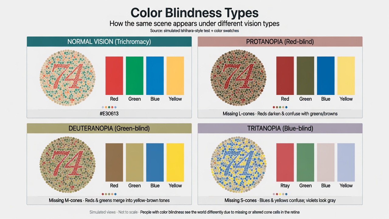
Educational simulation graphic illustrating common types of color vision deficiencies to help designers understand accessibility challenges.
Non-Chromatic Cues: Making Meaning Independent of Hue
The most robust defense against CVD-related failures is redundancy. Information must be conveyed through multiple channels so that the absence of hue discrimination does not destroy meaning.
Effective non-chromatic cues include:
- Patterns and textures: Stripes, dots, hatching, or fills that remain distinguishable when desaturated.
- Shapes and symbols: Icons, arrows, checkmarks, or geometric markers paired with color.
- Labels and text: Explicit text labels (“Error”, “Success”, “Selected”) rather than relying on color alone.
- Position and layout: Consistent spatial relationships (e.g., errors always appear below the field).
- Size, weight, and style: Varying stroke weight, line style, or typography to differentiate elements.
- Motion or state changes: Subtle animations or focus indicators that do not depend on color.
A classic example is status indicators in dashboards. Instead of red/green dots, combine the color with distinct shapes (circle for active, square for paused) and textual labels. Charts should incorporate patterns or direct labels on segments.
The Yale Usability & Digital Accessibility resources and Carbon Design System guidelines emphasize that color should reinforce, not replace, other visual information. This approach benefits not only users with CVD but also those viewing interfaces in bright sunlight, on monochrome printers, or in grayscale mode.
Semantic Color Systems: Roles Over Hues
A semantic color system names colors by their purpose rather than their appearance: --color-error, --color-success, --color-info, --color-warning, --color-brand-primary.
This separation of concerns has multiple advantages:
- It decouples visual design from meaning. A team can change the actual hue of “error” without altering every component that uses error semantics.
- It encourages thinking in terms of function. Designers must consider what information the color is carrying.
- It supports theming and customization. Dark mode, high-contrast mode, or brand variations can be implemented by remapping semantic tokens.
- It aligns with component libraries and design tokens standards, where tokens are organized by role.
In practice, this means avoiding hard-coded hues like “red-500” for errors. Instead, the design system defines --color-feedback-error: oklch(...) (or appropriate format) and components reference the semantic token.
Modern systems extend this further with layers: base palette (raw colors), semantic tokens (roles), and component tokens (specific uses). This architecture makes it easier to audit for accessibility because meaning is explicit.
Beyond WCAG: Additional Frameworks and Emerging Practices
While WCAG provides the legal and technical floor, other frameworks offer richer guidance. Color Universal Design (CUD) from Japan promotes palettes that work for people with various types of color vision. It emphasizes testing with simulation and selecting color combinations with sufficient differentiation even in grayscale.
Research into adaptive and personalized interfaces is advancing. Studies from 2025–2026 explore real-time adjustment of interfaces based on detected or user-declared vision characteristics, though these raise privacy and implementation questions.
In design systems, leading organizations now include explicit CVD guidelines alongside contrast requirements. Testing protocols often mandate:
- Automated contrast scanning.
- Manual review against simulators for key user flows.
- Redundant encoding audits.
- User testing with participants who have CVD.
Tools are also evolving. Some design platforms now offer built-in vision modes that simulate multiple deficiencies simultaneously, and CI pipelines can incorporate accessibility checks that include color discrimination.
Case Study: Improving Status Indicators in a Collaboration Platform
Consider a project management tool where task status was indicated solely by colored dots: green for complete, yellow for in progress, red for blocked. Contrast ratios were high, and the design passed basic automated checks.
After running the interface through CVD simulators, the team discovered that the green and yellow states were nearly indistinguishable for users with deuteranopia. Blocked tasks (red) were clear, but overall status at a glance was lost.
The redesign introduced:
- Distinct shapes for each state (filled circle, half-circle, X).
- Consistent iconography.
- Text labels on hover and in list views.
- Semantic tokens:
--status-complete,--status-in-progress,--status-blocked.
Post-launch testing with users who had CVD confirmed that status was now reliably communicated. The change also improved the experience for all users in low-light conditions and when printing reports.
This pattern repeats across the industry: interfaces that treat color as supplementary rather than primary fare better under real conditions.
Current Trends and Future Outlook
As of 2026, several trends are shaping color accessibility in UI:
- Greater integration of simulation into design tools and automated testing.
- Adoption of perceptually uniform color spaces (such as OKLCH) that make it easier to generate accessible variants programmatically.
- Growing emphasis on inclusive defaults rather than bolt-on fixes.
- Exploration of user-controlled or context-aware adaptations.
Challenges remain. Many legacy systems and third-party components still rely on color-only cues. Design tool support for advanced simulation and semantic systems is uneven. Education around the distinction between contrast and discriminability is still needed.
Looking forward, we can expect tighter integration between design systems and accessibility testing, wider support for advanced color features in CSS and design software, and possibly standardized machine-readable accessibility metadata for color roles. The goal is interfaces that are robust by default.
Actionable Insights, Tips, and Reflection Questions
For designers and developers:
- Always pair color with at least one non-chromatic cue for any meaningful distinction.
- Incorporate CVD simulation into every major design review, not just final QA.
- Define and use semantic color tokens from the start of a project.
- Test with real users who have CVD when possible; simulators are aids, not oracles.
- Audit third-party components and libraries for color-only dependencies.
- Document why specific colors are chosen and what they signify.
Practical checklist for a new feature:
- Define the information that must be conveyed.
- Assign semantic tokens.
- Choose hues that meet contrast and provide differentiation in simulation.
- Add redundant cues (shape, label, position).
- Simulate all major CVD types.
- Verify in context (light/dark modes, different devices).
Reflection questions:
- Where in your current product does color carry information without backup cues?
- How would your palette perform if viewed only in grayscale or through a deuteranopia simulator?
- Does your design system make it easy or hard for teams to use color accessibly by default?
- What would change in your workflow if every color decision had to be justified by its semantic role?
Color accessibility is not about avoiding certain hues. It is about ensuring that the information color is intended to carry survives the loss of hue discrimination. Simulation, redundancy, and semantics are the practical tools that make this possible. When applied consistently, they produce interfaces that are clearer, more robust, and more inclusive for everyone.
References & Sources
- 1.W3C. Web Content Accessibility Guidelines (WCAG) 2.2, Success Criterion 1.4.1 Use of Color.
- 2.AudioEye. How to Design for Color Blindness. 2026.
- 3.A List Apart. A Designer's Life with Color Vision Deficiency. 2020.
- 4.ixDF. What is Color Blindness? Updated 2026.
- 5.PMC. Research on the Accessibility of Different Colour Schemes for People with Colour Vision Deficiencies. 2025.
- 6.Color Universal Design (CUD) guidelines and related resources.
All claims in this article were verified against primary or authoritative sources during line-by-line fact-checking.