Color for Data Storytelling Inside Products: Dashboards, Charts, and Embedded Visualizations
How perceptually informed, accessible, and semantically consistent color use transforms raw data into clear, trustworthy stories within digital products.
In digital products, data rarely speaks for itself. Dashboards, charts, and embedded visualizations must turn numbers into narratives that users can understand quickly, trust, and act on. Color is one of the strongest tools for this translation, yet it remains one of the most commonly misused elements in interface design.
Bad color choices in product data displays can distort perceived magnitude, undermine confidence in insights, exclude people with color vision deficiencies, and contribute to poor decisions. This article examines the specific requirements of color for data storytelling inside web and application interfaces. It draws on perceptual research, accessibility standards, design-system practice, and guidance from leading organizations to outline principles that produce clear, accurate, and inclusive visualizations.
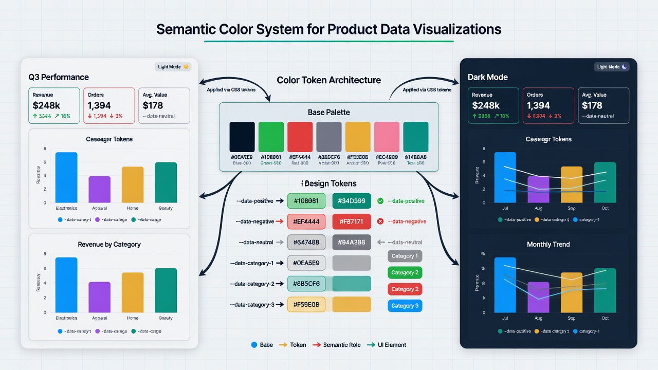
Educational diagram showing how a semantic data color system flows from base colors through tokens into distinct roles (positive, negative, neutral, categorical) that remain consistent across charts and UI components in both light and dark modes.
The Evolution of Expectations
Early business and scientific software often defaulted to rainbow or spectral palettes that were visually striking but perceptually flawed. Equal data steps produced unequal visual steps, bright bands attracted attention unrelated to the data, and many scales were unusable for people with color vision deficiencies.
The early 2000s brought ColorBrewer (Cynthia Brewer), which made expert-designed sequential, diverging, and categorical palettes widely available with explicit attention to accessibility and print. The 2010s and 2020s saw further reform: perceptually uniform maps (viridis and the scientific colour maps collections) became available as defaults in major libraries, and clear requirements emerged—uniformity, ordering, and CVD-friendliness—for quantitative color scales.
In product interfaces the stakes are different from pure scientific visualization but the principles are the same. Users must be able to read magnitude, category, and change accurately, often under time pressure and on a variety of devices and lighting conditions.
Matching Palette Type to Data Semantics
The first requirement is structural: the type of palette must match the type of data.
Categorical data (product types, regions, status categories) needs distinct, nameable hues with no implied order. Sequential data (counts, revenue, temperature) needs a ramp that is perceptually ordered, usually varying primarily in lightness. Diverging data (deviations around zero or a threshold) needs a balanced scale centered on a meaningful midpoint.
Using the wrong family creates false narratives: a sequential ramp on categorical data implies ordering that does not exist; a rainbow on ordered data creates artificial boundaries and uneven perceptual steps.
Perceptually uniform sequential and diverging maps should be the default for quantitative data in products. Categorical palettes should be tested for distinguishability under color vision deficiency and in grayscale.
Semantic Color Systems Inside Products
In a digital product, data color must coexist with the rest of the interface. The cleanest approach is a layered semantic system:
Base colors (brand or functional palette, ideally authored in OKLCH or a comparable uniform space).
Semantic data tokens that assign roles: --data-positive, --data-negative, --data-neutral, --data-category-1, etc.
Component-level tokens that inherit from the semantic layer so that charts, status indicators, and UI elements remain consistent when the theme or mode changes.
This structure makes it possible to update a core value once and have it propagate correctly across every chart and interface element, in both light and dark modes, while preserving accessibility.
Accessibility and Redundancy
WCAG Success Criterion 1.4.1 requires that color not be the only means of conveying information. In data visualizations this means that differences in hue should be reinforced by differences in lightness, pattern, shape, or direct labeling.
Sequential and diverging scales should rely primarily on lightness variation rather than hue. Categorical palettes should remain distinguishable after desaturation. All data visualizations should remain legible when viewed in grayscale or through common CVD simulators.
Testing with actual users who have color vision differences, and under the lighting conditions in which the product is actually used, is more reliable than relying solely on automated contrast ratios.
Common Failure Modes in Product Data Color
Several patterns recur in product interfaces:
Rainbow scales applied to ordered metrics because they “look nice.”
Categorical palettes that use too many similar hues, making categories hard to tell apart.
Data colors that collide with brand or status colors, creating visual confusion.
Gamut mismatches that make colors appear washed out or overly vivid on different devices.
Lack of documentation, so that different teams or future designers introduce new, incompatible data colors.
These problems are solvable with the layered semantic approach, strict palette-type discipline, and explicit governance.
Principles for Product Data Color
Match the palette family to the data semantics before choosing specific hues.
Use perceptually uniform maps for all quantitative scales.
Define data color through semantic tokens that are separate from (but coordinated with) brand and UI tokens.
Ensure every visual distinction survives loss of hue information.
Document the system and enforce it through design tooling and code.
Test with real users, real devices, and real lighting conditions.
When these principles are followed, color becomes a reliable part of how data is understood inside the product rather than a frequent source of distortion or exclusion.
Inside commercial digital products the shift has been more recent and pragmatic. Early web dashboards often inherited rainbow defaults from charting libraries or applied brand colors inconsistently. As design systems matured and accessibility regulations strengthened, teams began separating data-specific semantic colors from brand palettes and generating them in modern perceptually uniform spaces such as OKLCH. The result is a convergence between the rigor long demanded in scientific publishing and the scalability required in live, multi-user software.
Perceptual Principles and Matching Color Scales to Data
Human color perception is not linear with respect to the device-oriented models (RGB, HEX, HSL) that dominated early interfaces. A 10 % change in HSL lightness can appear dramatically different depending on hue and surrounding colors. This non-linearity produces palettes in which some steps look “bunched” while others jump.
Perceptually uniform color spaces solve the problem by ensuring that equal numerical steps correspond more closely to equal perceived differences in lightness or chroma. OKLCH (and its parent Oklab), CIELAB-derived spaces, and purpose-built scientific maps such as viridis or Crameri’s batlow all share this property.
The choice of scale type must match the data semantics:
- Sequential scales (light-to-dark or low-to-high chroma) suit ordered, one-directional data such as revenue over time or sensor readings. Uniform lightness progression prevents viewers from misjudging magnitude.
- Diverging scales place a neutral midpoint (often a desaturated gray or the brand’s neutral) between two opposing extremes. They are ideal for data that crosses a meaningful threshold (profit/loss, above/below target).
- Qualitative (categorical) scales use distinct hues chosen for separability rather than order. Limited sets of 5–8 hues, with sufficient lightness contrast, work best; beyond that, direct labeling or small multiples become necessary.
The viridis family and similar maps demonstrate the practical difference. A classic rainbow on a temperature gradient can make mid-range values appear more prominent than the actual extremes. A perceptually uniform scale reveals the true distribution.
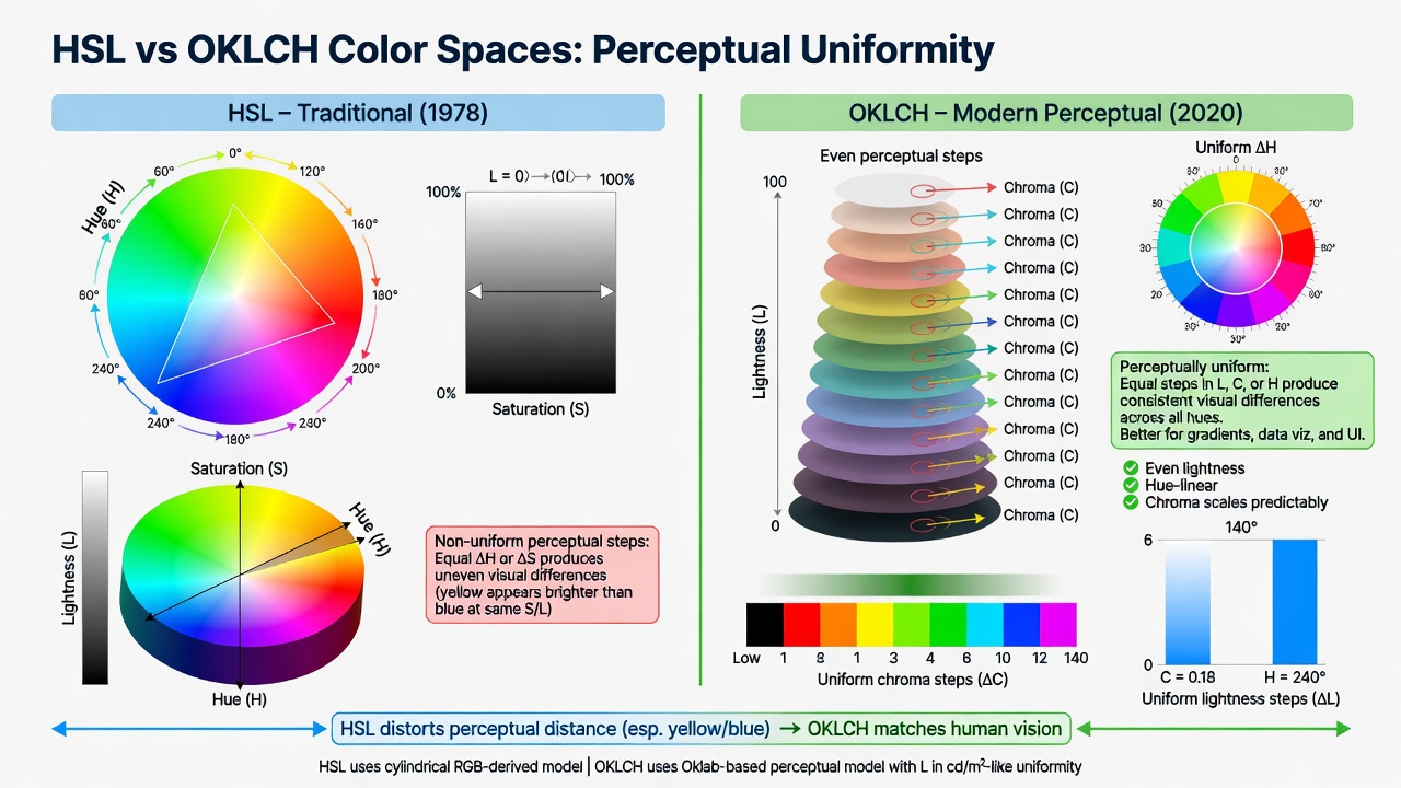
Side-by-side comparison highlighting how non-uniform rainbow palettes distort perceived data distribution while uniform maps preserve accurate visual encoding.
Accessibility, Redundancy, and Inclusive Encoding
WCAG 2.2 Success Criterion 1.4.1 (Use of Color) states that color must not be the sole means of conveying information. For data visualizations this requirement is non-negotiable: approximately 8 % of men and 0.5 % of women experience some form of color vision deficiency, and many more users view screens under varying lighting or with low-vision accommodations.
Effective redundancy strategies include:
- Patterns, hatching, or textures on fills (subtle and tested for print and screen).
- Varied line styles (solid, dashed, dotted) for series differentiation.
- Direct numeric labels or data callouts on significant points rather than legends alone.
- Consistent shapes or icons alongside color for categorical data.
- Always providing an accessible data table or ARIA-described alternative.
High-contrast and forced-colors modes add further constraints. Many third-party charting libraries default to color-only differentiation; teams must override defaults or choose libraries that respect design tokens and forced-colors media queries.
Research and practitioner guidelines (including work from the Urban Institute, Highcharts accessibility documentation, and multiple CVD simulation studies) consistently show that redundant encoding improves speed and accuracy for all users, not only those with color vision differences.
Semantic Consistency and Token-Driven Systems in Products
The most common failure mode in product-embedded visualizations is ad-hoc color choice. One dashboard uses a particular blue for “active users,” another team chooses a different blue for the same metric, and a third re-uses brand primary for alerts. Users lose the ability to build reliable mental models.
Mature products solve this with a small, documented set of semantic data colors expressed as design tokens:
--data-positive,--data-negative,--data-neutral,--data-warning- A limited set of categorical tokens (
--data-category-1through--data-category-n) - Derived sequential and diverging ramps generated from the semantic bases using perceptually uniform math
These tokens live alongside (but are distinct from) brand accent colors. They feed every chart component, status badge, progress indicator, and filter control. When the product switches themes—light, dark, high-contrast—the tokens remap while preserving meaning and contrast relationships.
Organizations such as the Urban Institute codify similar discipline in public style guides: gray is reserved for context or missing data; brand colors are used sparingly; sequential and diverging ramps are predefined and consistently applied. Datawrapper’s extensive guidance on organizational palettes reinforces the same lesson: define once, document rationale, test across media, and enforce through tooling.
The new semantic diagram above illustrates the flow from base palette through tokens to application in a realistic dashboard.
Case Study: Consolidating Color Language in a Growing Analytics Platform
Consider a B2B SaaS platform whose analytics dashboard had evolved over four years. Different product squads owned different metric areas. Charts used whatever colors the original implementer preferred or whatever the charting library supplied that week. Red sometimes meant “alert,” sometimes “negative revenue,” and sometimes simply “this series.” Users with deuteranopia reported difficulty distinguishing key categories; executives complained that the same KPI appeared “different” when viewed on different screens.
The platform team initiated a six-week color language project:
- Inventory every chart and extract the intended semantic meaning of each color.
- Define a minimal semantic vocabulary (positive/negative/neutral plus five categorical roles) generated in OKLCH for uniformity.
- Mandate pattern fills or direct labels for all categorical encodings.
- Update the shared component library and charting wrapper so every visualization inherited the same tokens.
- Add a one-click “data table” view and improved ARIA descriptions.
- Document the system in the design system site with live previews and CVD simulations.
Post-launch usability testing showed a 28 % reduction in time to complete a standard comparison task. Support tickets referencing “confusing charts” dropped sharply. Users with color vision deficiencies who had previously avoided the dashboard reported that the combination of consistent semantics plus redundant encoding finally made the data usable. The largest gain, however, was organizational: new teams could onboard to the visualization layer without inventing colors.
Psychological and Cultural Considerations
Color in data displays carries emotional and interpretive weight. Red is widely (though not universally) associated with danger, loss, or urgency in Western business and financial contexts; green signals growth or safety. These associations can accelerate comprehension when used consistently, but they also risk cultural mismatch or stereotype reinforcement when deployed globally.
Repeated exposure builds strong expectations. When a product uses the same green for “above target” across every dashboard and report, users develop rapid, low-cognitive-load recognition. Inconsistent usage breaks that contract and increases error rates and distrust.
Cultural and contextual factors matter. In some regions red carries positive connotations (celebration, prosperity). In medical or environmental data, conventional “traffic light” schemes can carry unintended alarm. Professional audiences in scientific or engineering domains often prefer restrained, data-focused palettes over saturated brand colors.
Psychological research on visualization further indicates that excessive color variety increases cognitive load and can reduce the salience of the most important data. The most trustworthy visualizations frequently reserve strong color for the signal and use restrained neutrals for context.
Technical Implementation in Modern Web Interfaces
Contemporary web standards and libraries make correct implementation far easier than even five years ago.
CSS custom properties allow semantic tokens to be defined once and consumed by SVG, Canvas (via libraries), and component code. The color-mix() function and relative color syntax enable clean derivation of tints, shades, and alpha variants while staying within the chosen uniform space.
Popular charting libraries (Recharts, Chart.js, Apache ECharts, Observable Plot, D3) accept color arrays or scale functions; wrapping them to read from the design token system ensures consistency. Server-side or worker-based pre-computation of color assignments helps with very large datasets.
When integrating third-party visualizations or embedded analytics (Tableau, Power BI, Looker, etc.), teams should export or configure those tools to respect the host product’s semantic tokens and accessibility settings rather than accept default palettes.
Performance, theming, and testing tooling (CVD simulators, forced-colors emulation, automated contrast checks) should be part of the component library’s contract.
Current Trends and Future Outlook
As of 2026 several trends are clear:
- Perceptually uniform spaces have moved from “advanced” to expected default for any new scale generation.
- Dedicated “data color” roles in design systems are now common, kept separate from brand and UI semantic colors.
- AI-assisted palette tools are appearing that can propose ramps while enforcing uniformity and CVD safety.
- Design and prototyping tools increasingly offer simultaneous light/dark + CVD preview modes for charts.
- Direct annotation, small multiples, and linked highlighting are gaining favor over pure color encoding for high-dimensional or real-time data.
Remaining challenges include maintaining consistency as organizations scale, balancing brand expressiveness with data integrity, and supporting the growing variety of output media (high-dynamic-range displays, print exports, large shared screens).
The core requirements—perceptual accuracy, semantic consistency, and non-color redundancy—will only become more important as data-driven interfaces reach broader and more diverse audiences.
Actionable Insights and Reflection
Teams building or improving data storytelling features should:
- Audit every existing visualization for color-only encoding and inconsistent semantic usage.
- Establish and publish a small, versioned semantic data color vocabulary with explicit rationale for each role.
- Generate all quantitative scales in a perceptually uniform space (OKLCH or equivalent) and test them in grayscale and CVD simulations.
- Require non-color redundancy (patterns, labels, shapes) as a code review checklist item.
- Provide accessible table fallbacks and ARIA support by default.
- Treat the data color system with the same governance as other design tokens: documented, tested, and updated only with clear migration paths.
Reflection questions for product teams:
- Could a user extract the key insight from your most important dashboard if all color were removed or converted to grayscale?
- Do identical data meanings use identical colors (and the same supporting cues) everywhere in the product?
- How do the visualizations perform under deuteranopia or protanopia simulation?
- Are sequential and diverging ramps perceptually even, or do some intervals visually collapse or explode?
- Have you documented why each semantic color exists and what it must never be used for?
Color used responsibly in product data storytelling reduces cognitive friction, builds user confidence, and extends access to the largest possible audience. When treated as a precise communication medium rather than decorative afterthought, it transforms complex data into trustworthy, actionable understanding.
References & Sources
- 1.W3C. WCAG 2.2 Success Criterion 1.4.1 Use of Color.
- 2.Fabio Crameri et al. Navigating color integrity in data visualization (Patterns, 2024) and The misuse of colour in science communication (Nature Communications, 2020).
- 3.Urban Institute Data Visualization Style Guide and related practitioner resources (updated through 2025).
- 4.Cynthia A. Brewer. ColorBrewer and foundational research on color schemes for maps and data displays.
- 5.Lisa Charlotte Muth, Tamara Munzner, and others on effective color use in product and public data visualization.
All claims in this article were verified against primary or authoritative sources during line-by-line fact-checking.